There is a famous English adage, “A picture is worth a thousand words”, meaning that a single image sometimes explains complex or multiple ideas way better than words. Namely, data visualization is a great medium to communicate with our audience.
Data visualization is useful for not only presenting the insights gained but also exploring the data at hand. Understanding the structure of the data, detecting outliers, identifying trends and clusters, choosing a model to apply, evaluating the model output, and finally presenting results can be effectively done via data visualization. This process is also known as EDA or Exploratory Data Analysis.
What is Matplotlib Cheat Cheet?
Python provides many visualization packages for EDA, however, the Matplotlib library is the mother of all of them. Matplotlib.org defines Matplotlib as a “comprehensive library for creating static, animated, and interactive visualizations in Python.”
Since Matplotlib is a very comprehensive library, there are many cheat sheets, especially for beginners, to make plotting easier. However, sometimes they can also be a little bit confusing due to using only “x” and “y” in the cheat sheet codes, rather than using real data.
Here we will explain Matplotlib plot types, how to plot with real data, when to use them, and finally provide a brand-new, broadly explained cheat sheet.
Learn Details of Matplotlib Plot Types
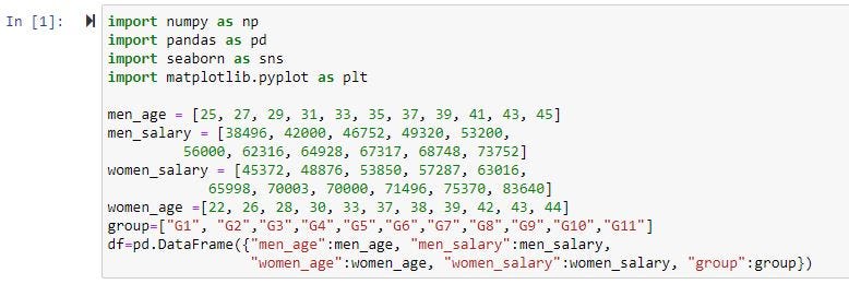
Let’s start with importing required libraries and creating a simple data frame.
1- Line Plot:
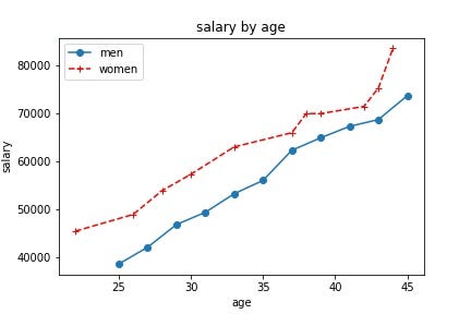
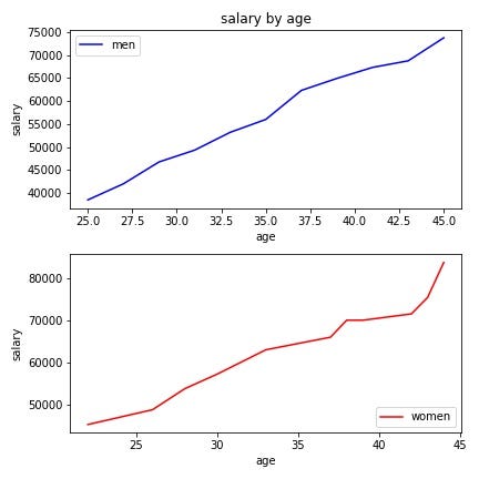
Line plots are commonly used to display change over time, helping to determine the relationship between two sets of values.
The Matplotlib library enables us to use either a functional or object-oriented method to create a plot. We will use both methods in creating a line plot.
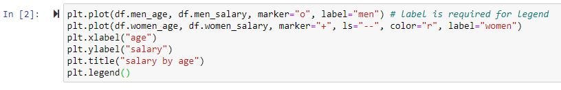
a- Functional Method:
Although the code itself is self-explanatory, let’s explain it step by step.
- Define the x-axis and corresponding y-axis values.
- Plot them on canvas using .plot() function.
- Give a name to x-axis and y-axis using .xlabel() and .ylabel() functions.
- Give a title using .title() function.
- Use .legend() to label the lines in the plot. You can change the loc parameter inside .legend() to change the location of the legend.
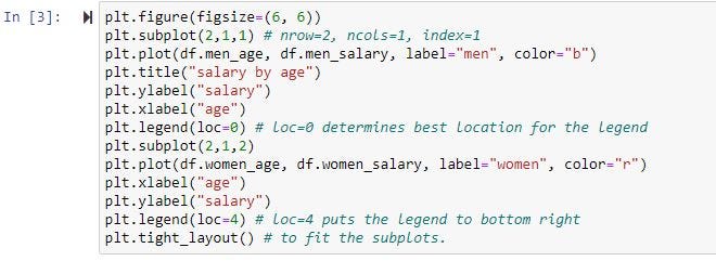
In the Matplotlib Functional method, we can also create subplots. To do this, we use plt.subplot() function and assign the number of rows, the number of columns, and index values.
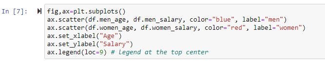
b- Object-Oriented Method:
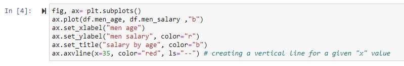
Basically here we use “ax”, which is the object of the class “fig” to create a plot.
- Use fig, ax=plt.subplots() and ax.plot() to create figure and plot(s).
- Give a name to x-axis and y-axis using .set_xlabel() and .set_ylabel() functions.
- Give a title using .set_title() function.
- For vertical line use .axvline() and for horizontal line use .axhline() functions.

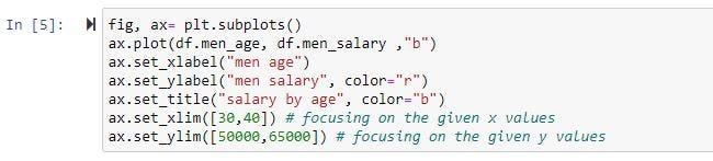
Setting x_lim and y_lim:
If we want to focus on a specific area on the plot we can use .set_xlim() and .set_ylim() with a list of values to focus.

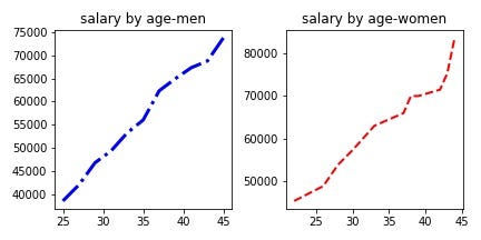
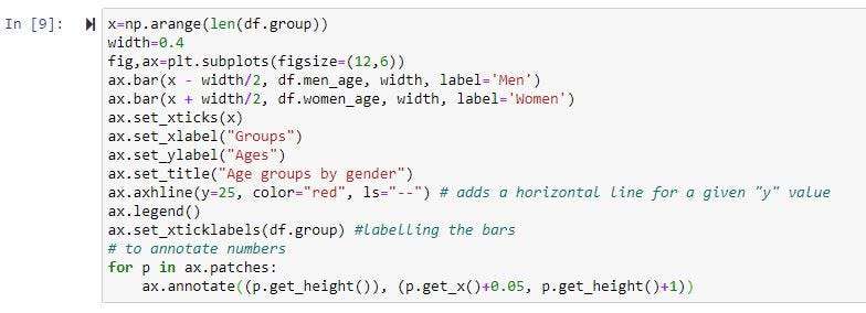
Creating a Subplot:
In order to create a subplot in the object-oriented method, we can use fig, ax=plt.subplots() and pass the number of rows and columns inside.

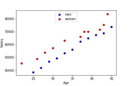
2- Scatter Plot:
Scatter plots are commonly used for displaying the relationship between two variables.
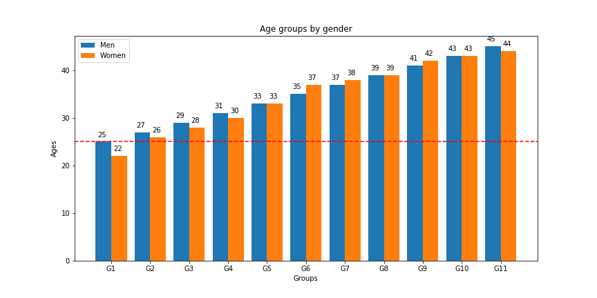
3- Bar Plot:
Bar plots are the best option for representing comparative data. They are commonly used especially for performing a comparison across different subgroups of our data.
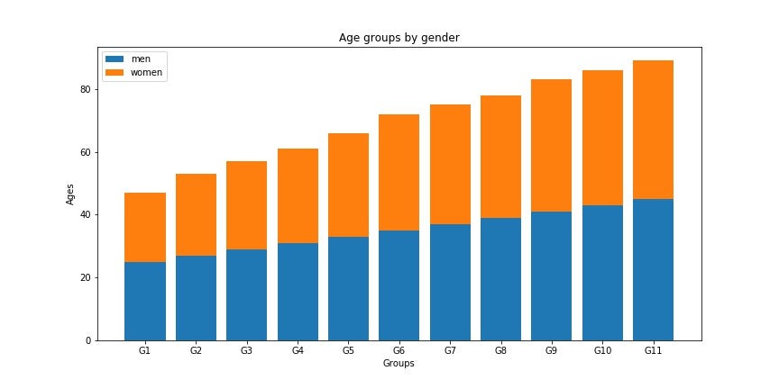
Stacked Bar Plot:
In order to create a stacked bar plot, we can use the bottom parameter inside ax.bar().
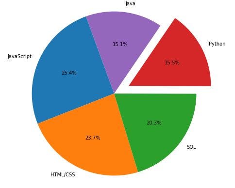
4- Pie Chart:
Pie charts are best used when we need to visualize the part-to-whole relationship in our data. They easily convey the proportions of the subcategories comprising the data.
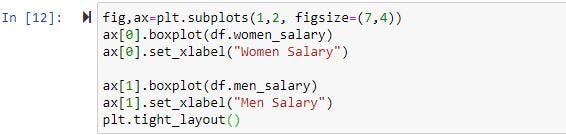
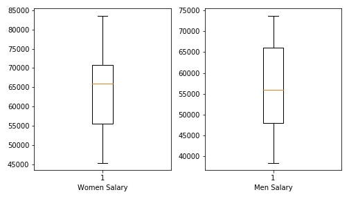
5- Box Plot:
Box plots are the best way of summarizing a set of data measured on an interval scale and they provide information from a five-number summary: first quartile, median, third quartile, and maximum score.
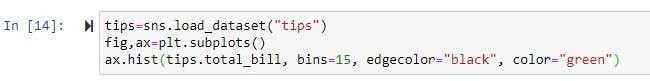
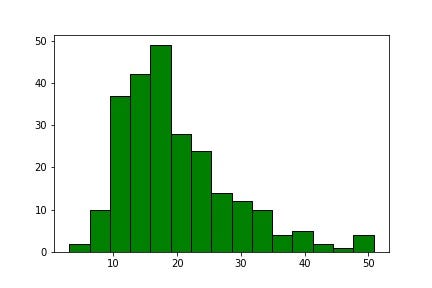
6- Histogram:
Histograms display the distribution of our data by showing the number of data points that fall within a specified range of values (bins) and they are especially useful in understanding the general distribution of data and detecting outliers.
Final Thoughts About Matplotlib
- Data visualization and storytelling with data are essential skills for every data scientist to convey insights gained from analysis.
- Python’s Matplotlib library is a very powerful tool to create visualizations.
- Knowing when to use what kind of plot is crucial for communication with the audience.
You can download the cheat sheet containing all the codes from here.